

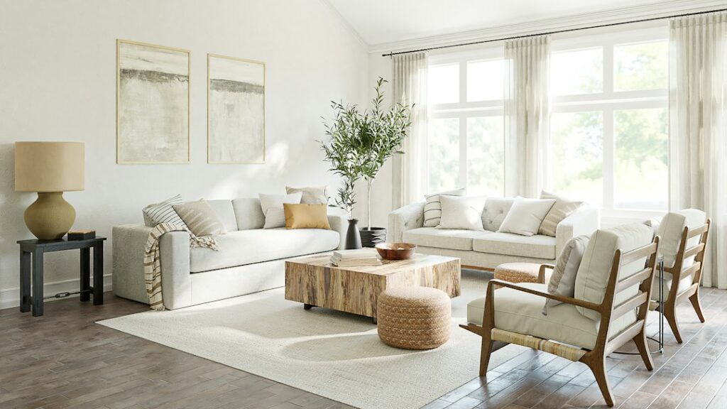
Which colors create an elegant living room?
Elegant living spaces usually rely on a restrained palette rather than a large number of competing colors. The most dependable approach is to combine a calm base color, one or two supporting tones, and a small number of deeper accents.
For homes in Southern Pines, NC, palettes that reflect natural surroundings often feel especially comfortable. Warm neutrals, muted greens, soft blues, clay tones, and natural wood shades can create rooms that feel polished without becoming formal or delicate.
A practical starting formula is:
- 60 percent: walls, large upholstery, rugs, or other dominant surfaces
- 30 percent: secondary furnishings, curtains, cabinetry, or accent chairs
- 10 percent: artwork, pillows, lighting details, ceramics, or decorative objects
This ratio is not a strict design rule. It simply helps keep the room visually balanced.
Are warm neutrals still a good choice for refined interiors?
Yes. Warm neutrals remain among the most adaptable choices for elegant interiors because they soften architectural lines and work well with wood, stone, metal, and woven materials.
Useful warm-neutral shades include:
- Soft ivory
- Oatmeal
- Mushroom
- Warm taupe
- Sand
- Putty
- Light caramel
A warm neutral does not have to look beige or dated. The appearance depends on undertones, lighting, finish, and surrounding materials. For example, a pale mushroom wall can feel contemporary beside charcoal upholstery, while creamy ivory may appear more traditional with walnut furniture and brass accents.
In rooms with substantial natural wood, avoid selecting a wall color that is nearly identical to the wood’s undertone. Slight contrast helps both surfaces remain visible. A cooler stone-colored neutral can balance reddish or honey-toned wood, while a warmer beige may complement gray-brown finishes.
How can green be used without making a room feel themed?
Muted green works well as an elegant accent because it connects interior spaces with the landscape while remaining quieter than brighter greens. The most versatile versions have gray, brown, or blue undertones.
Consider:
- Sage for walls or upholstered seating
- Olive for occasional chairs, drapery, or cabinetry
- Moss for pillows, artwork, or a reading nook
- Eucalyptus for bedrooms and soft furnishings
- Deep forest green for a controlled statement wall or bookcase
Green is particularly effective when paired with natural textures such as linen, rattan, aged wood, leather, and stone. To prevent the room from feeling overly coordinated, vary the materials and use only one or two green shades.
A common misconception is that dark green automatically makes a room feel smaller. In fact, a deep color can make a space feel layered and intimate when the room has adequate lighting and the furnishings are not overcrowded.
Which blue palettes feel sophisticated rather than cold?
Blue can create a calm, tailored atmosphere, but the undertone matters. Blue with a touch of gray, green, or muted violet is generally easier to live with than a bright, highly saturated blue.
Elegant blue combinations include:
- Dusty blue with ivory and walnut
- Slate blue with warm white and aged brass
- Blue-gray with camel leather and natural oak
- Muted navy with soft tan and cream
- Faded denim with terracotta and woven textures
In rooms with strong sunlight, blue-gray can appear more balanced throughout the day. In spaces with limited natural light, a warmer blue or a blue used primarily in textiles may be more comfortable.
Navy is best treated as a strong accent unless the room is spacious and well lit. It can add depth to built-ins, a library wall, a sofa, or selected cabinetry without dominating the entire interior.
What earthy colors add warmth and character?
Earth tones help an elegant room feel grounded and livable. Clay, terracotta, cinnamon, ochre, tobacco, and muted rust can bring warmth to a palette built around ivory, taupe, or gray.
These colors are usually most successful in controlled doses. Try them in:
- A patterned rug
- Ceramic vessels
- Accent pillows
- A leather chair
- Artwork
- Dining chairs
- Drapery trim
A muted terracotta pillow can enliven a neutral sofa without changing the character of the room. Similarly, a tobacco-colored leather piece can introduce depth while remaining compatible with both traditional and contemporary furnishings.

Earth tones also work well with the seasonal rhythm of the region. Warm colors can make spaces feel inviting during cooler months, while natural linen, pale woods, and lighter versions of the same palette keep the room comfortable during warmer seasons.
How should color choices account for Southern Pines homes and weather?
Local light and seasonal conditions can influence how colors appear indoors. Bright daylight may make pale colors look more reflective and saturated colors look stronger. Humidity and warm weather also make breathable, visually light materials appealing in everyday living areas.
For that reason, many households benefit from combining:
- Matte or low-sheen walls
- Light-filtering window treatments
- Natural-fiber rugs
- Linen or cotton upholstery
- Wood finishes with visible grain
- Colors that remain comfortable in both bright and overcast light
Large windows should be evaluated at different times of day before a final color decision is made. A shade that appears soft in morning light may look much warmer in late afternoon. Painted sample boards are more reliable than small paper swatches because they show how color interacts with flooring, furnishings, and sunlight.
What are elegant color combinations for open-concept rooms?
Open-concept interiors need enough variation to define separate areas without making the home feel visually fragmented. The easiest method is to use one dominant neutral throughout connected spaces and introduce different accents by zone.
For example:
- Living area: ivory, walnut, and muted green
- Dining area: warm taupe, charcoal, and aged brass
- Reading area: soft blue, camel, and cream
The shared neutral keeps the spaces connected, while the accent colors give each area its own identity. Repeating one color in small details—such as artwork, pillows, or ceramics—helps the entire floor plan feel intentional.
Avoid using a different wall color in every connected area unless the architecture clearly separates the rooms. Too many unrelated colors can make an open layout feel smaller and less settled.
How can a neutral room avoid looking flat?
A neutral palette needs contrast in texture, tone, and scale. Using several beige objects with the same finish often creates a dull result, even if the colors technically match.
Add visual depth through:
- Smooth wood beside nubby upholstery
- Linen beside velvet or leather
- Polished metal beside matte ceramics
- Light walls beside medium-tone furnishings
- Small dark accents against pale surfaces
- Patterned textiles with low-contrast color changes
Layering does not require bright color. A room using cream, taupe, and brown can feel richly detailed when the materials vary. Black or charcoal accents can also sharpen the palette, but they should be distributed thoughtfully rather than concentrated in one corner.
Should ceilings and trim match the walls?
Matching ceilings and trim to the wall color can create a calm, enveloping effect, especially with muted shades. Slightly lighter trim provides a more traditional appearance, while a deeper trim color can emphasize architectural details.
For a classic look, use a soft off-white rather than a stark white against warm wall colors. Bright white trim can make beige, clay, or muted green appear harsher by comparison.
The most successful color palette is one that supports the way a room is used. A living room should feel comfortable at different times of day, coordinate with existing furnishings, and remain appealing beyond a single decorating trend. Starting with the home’s natural light, flooring, wood tones, and daily routines usually leads to a more elegant result than choosing colors in isolation.